
Data Visualization
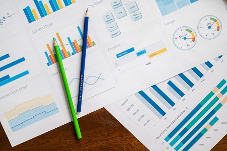
Data Visualization strengthens your message. Visualizations make the data communicate effectively. It is a pictorial representation of data and assists in better understanding of data.
We help organizations create interactive visualizations to take actionable-decisions.
Make data visualization your priority
Data visualizations help in the following ways:
- Provides clear understanding of data.
Raw data is difficult to comprehend but if same data is presented in terms of charts and tables, it makes it easy to understand and present. For example, a trend chart can display year by year progression of company’s revenue more effectively.
- Support key-decision makers.
A chart can easily depict the outliers in the data and assist decision makers in focusing in the right direction.
- Assimilate large amounts of data in a single visual
A single visualization can accommodate large amount of data. Multiple rows of data for several years, can easily be displayed in one chart. This helps in quick data analysis
- Get organizations Key Performance Indicators (KPI) at a glance.
A visual dashboard is similar to a automobile dashboard. It can provide the all the KPI’s at a glance.